Painting Ghosts
The MadPonies way

|
When I set out to finish my undead army, I discoverd that GW had changed one of their troop types from when I first started collecting my army (no surpise there). Ghosts as individual figures in a rank and file unit never really captured my attention, but for some reason multi-figure elements based as Spirit Hosts was slightly more appealing. It probably didn't hurt that in the intervening decade some more engaging figures had become available to fill such a niche.
|
|
|
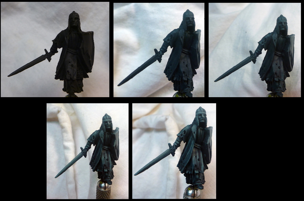
The first 5 images below show the progression from pure VMC Dark Sea blue up to Granite Light. In order to suggest a sort of floating look, I kept colors primarily darker on the bottom, so as I highlighted I not only applied paint to smaller areas topographically, but I also limited them to progressively higher and higher areas, in relation to the base.
|
|
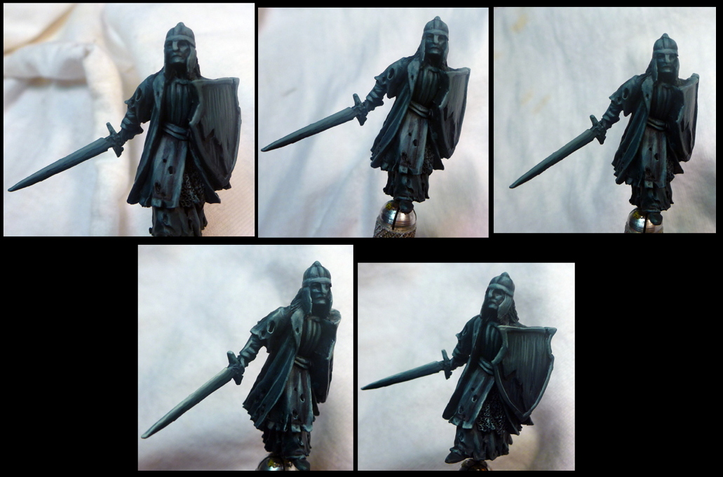
Once I reached a nearly pure application of Granite Light, I used the inks. First a lot of black ink in all the recesses of folds, low parts of the faces, the chainmail, crevices in armor, etc. Then an extra few washes of black in on the lower parts of the figure in general to accentuate the progression of bottom->top:dark->light.After the black ink comes a liberal application of Transparent Blue as a unifying glaze over the gradient I'd already built up (Images 1-3 below). In #s 4-5 below, I started mixinging the White Hightlight basically a mild ivory) into the Dark Sea Blue to begin the most dramatic of highlights. After a couple increasingly light applications, I hit it with a gentle Transparent Blue one more time, again, to unify the gradient that I've now built up to a sharper highlight on the extreme edges/tops of thing. Any areas that I felt could use more contrast will get another dab of black ink. Cracks in shields, folds in chainmail, insides/undercuts of clothing etc.
|
|
After that a last spot checking with some pure ivory on the edge of the sword blade etc, and inks in the crannies, its time to base it up, and under proper lighting, we have the following result: |
|
|
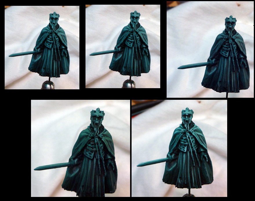
After I finished my spirit host I decided I wanted a couple ethereal characters for my force as well. I decided to try the same recipe, but with green this time, to see if I liked it at all, and hoping that the variety might be nice.
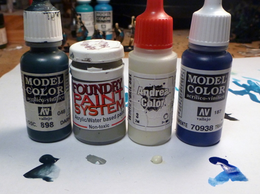
For this experiment I swapped in the following colors in place of the blue and blue ink:
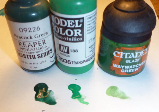 NB: Either of the green washes will work, but since I had both and hadn't worked much with either, I played with them both that the inkwash stages. The Citadel glaze is the less intense of the two and would probably be the best choice if you were worried about over doing it at first. The steps below follow the same series from black, to Peacock green to various mixes off Peacock Green + Granite Light. |

|
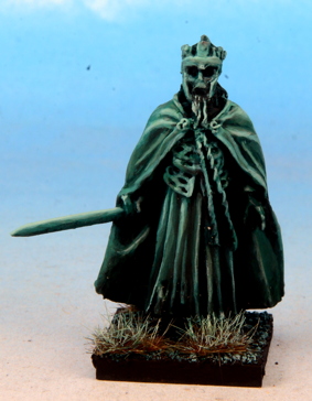
Under proper lighting the color becomes more true and you can see the final pallete:
|
|
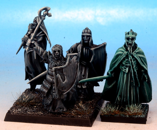
Back under the work light, here is the contrast between the blue and the green recipes: 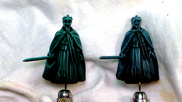 And under slightly less extreme lighting:
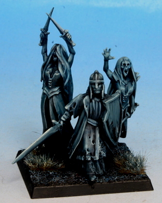
After I got the whole project done, here is my resulting spirit host: |

For the effort expended, I'm really happy with the results, and think these will be a rather dramatic addition to my undead collection, and a welcome departure from the rather monolithic effect of unit after unit of bone colored troops.
If you come up with another idea as a result of this recipe, I'd love to see your results. Get in touch!
This article is free to distribute for non-commercial purposes with proper attribution of all content and images:
Creative Commons Attribution-NonCommercial-NoDerivs2.5 License